RIPE Atlas now includes a new path analysis tool that makes it easier to understand how traceroute paths evolve over time. By comparing runs side by side, it highlights where the path changed and what kind of change it was. This gives you a fast, visual starting point for incident investigation, validation work, and troubleshooting without having to manually scan hop-by-hop traceroute output.
Traceroute data is invaluable for understanding network behaviour, but comparing the same traceroute over time manually is tedious. When investigating an incident, you might need to answer questions like:
(Free access, no subscription required)
When did the path to my target change?
Did my traffic shift to a different AS or IXP?
Is this latency increase happening at a specific hop?
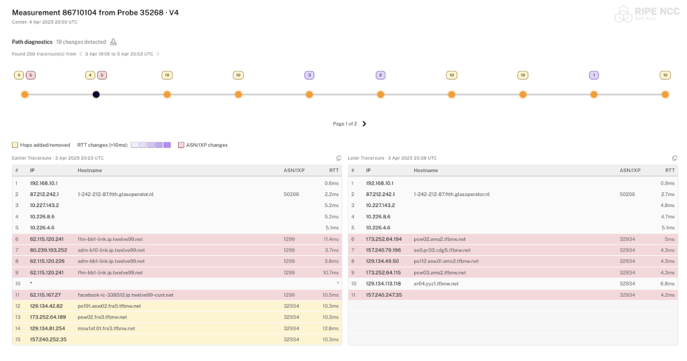
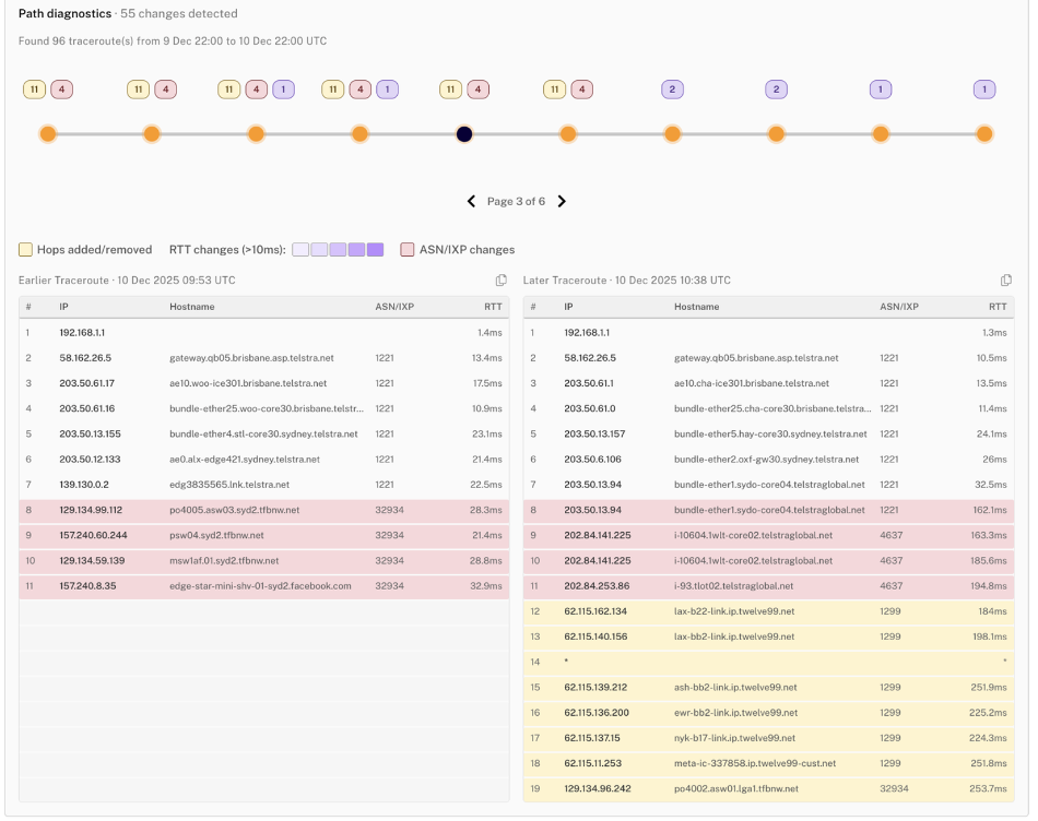
The new path analysis tool in RIPE Atlas provides clear visual answers to these questions. By putting two runs of the same traceroute measurement side by side, it lets you quickly see how and where the path changed over time. Instead of scanning hop by hop, you can immediately see at a glance where things diverged.
Two ways to explore changes
The tool distinguishes three types of change, each marked by a different colour:
Yellow – routing changes (hops added or removed)
Purple – performance degradation (significant RTT increases, with graduated intensity based on severity)
Red – ASN or IXP transitions (traffic moved to a different network)
With that colour key in mind, you can explore changes in two different ways, depending on whether you want an overview of when the path changed or a close look at what changed in a specific comparison.
When did the path to my target change?
Did my traffic shift to a different AS or IXP?
Is this latency increase happening at a specific hop?
The new path analysis tool in RIPE Atlas provides clear visual answers to these questions. By putting two runs of the same traceroute measurement side by side, it lets you quickly see how and where the path changed over time. Instead of scanning hop by hop, you can immediately see at a glance where things diverged.
Two ways to explore changes
The tool distinguishes three types of change, each marked by a different colour:
Yellow – routing changes (hops added or removed)
Purple – performance degradation (significant RTT increases, with graduated intensity based on severity)
Red – ASN or IXP transitions (traffic moved to a different network)
With that colour key in mind, you can explore changes in two different ways, depending on whether you want an overview of when the path changed or a close look at what changed in a specific comparison.
Sequential mode lets you navigate through all detected changes in a time window. An interactive timeline shows each point where something changed, with badges indicating the type of change. This is ideal for questions like “what happened to this path over the last 24 hours?” or “when exactly did the routing change?”
Sequential Mode
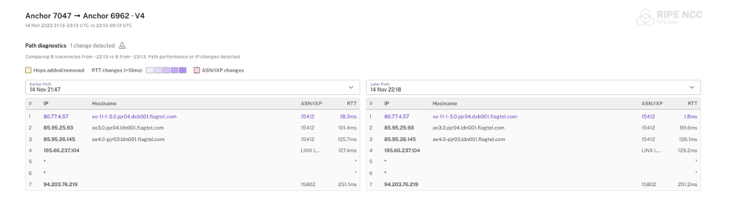
Comparison mode lets you compare two specific time periods directly – useful when you already know the “before” and “after” windows you want to examine. This is perfect for investigating maintenance windows or comparing performance before and after a change.
Comparison mode
Real-world use cases
Here are a few practical ways you might use the new path analysis tool during day-to-day operations, from incident response to longer-term visibility.
Incident investigation: A customer reports intermittent connectivity issues starting yesterday. Load their probe’s traceroute measurement in sequential mode, set a 48-hour window, and quickly spot when the path changed. For example, you might see traffic shift to a different upstream at 14:32 UTC, which you can then correlate with the time the problems began.
Maintenance validation: You’re peering at a new IXP and want to confirm traffic is actually taking the intended route. Compare traceroutes from before and after the change to verify the new path is in use, and check whether there’s any unexpected latency impact.
Ongoing monitoring: Use anchor-to-anchor measurements to keep an eye on connectivity between key points in your network over time. By reviewing changes periodically (and exporting data if needed), you can build a historical picture of path stability and spot recurring patterns.
Latency troubleshooting: Users complain about slow response times. Open the relevant measurement and look for purple highlighting to identify where RTT increases begin, then zoom in on the hop that’s contributing the additional latency.
Where can I use it?
In the RIPE Atlas UI…
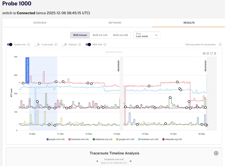
We’re rolling out the path analysis tool in various places across the RIPE Atlas interface. You can already find it in the Probe Detail page under the Results tab, where it helps you analyse traceroute measurements from specific probes, and we will be integrating it in other places soon.
For standalone use, the tool supports flexible URL parameters for specifying measurements, time windows, and display options. You can also toggle which types of changes to highlight and export the data as JSON, as well as copying any individual traceroute from within the layout.
Path Analysis is live on atlas.ripe.net. We’d love to hear how it works for your use cases – let us know what’s useful, what’s missing, or what could be improved.
Some example URLs
Before we finish, here are a few example URLs you can paste directly into your browser to try the different views and parameters yourself: